Featured Products
-
Sale!
-
Sale!
-
Sale!
-
Sale!
-
Sale!
-
Sale!

-
Sale!
-
Sale!

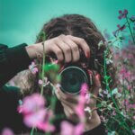
Create a SX-70 Style Vintage Image Using Photoshop by Jen Kiaba
Vintage is in, in a big way. From boutiques to magazines, everywhere you look it seems as though everything resonates with a tad of nostalgia. Personally, I love adding a little touch of vintage romance to my photography in Photoshop; when you pick your subjects carefully you can give your photos a timeless look without making them look dated.
There are varying levels of complexity to creating a vintage style photo. To begin with, I will share with you a very easy way to give your images a tonal quality that is reminiscent of the film from days of yore!
The other day I was browsing my friend Romin’s photography blog – he is the mastermind behind the Seattle-based Saia Weddings Photography Studio. His style, while not strictly  vintage, often evokes hints of classic film cameras – such as the Diana and the SX-70.
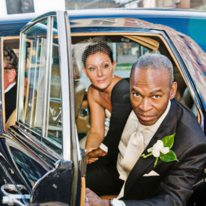
Most recently he posted a photo that made my jaw drop – he had mimicked the warm tones and softness of the Vintage Polaroid SX-70 so well!

Knowing that he shoots digitally, and that the image was not actually captured on film, I had to know his secret! Note the warm tones of the sky and the landscape. Without going overboard, he has created an image that references the instant film that was so popular several decades ago.
Luckily for me, he was happy to share how to give your photos that touch of faded whimsy!
According to Romin, the trick is to pick a few warmer tones from your original photo:
With these colors in your palette, create a new Gradient Map Layer:

At first it will look like this (but worry not!):

Set this layer to the Soft Light blending mode.

Now everything has that warm softness that old Vintage Polariod SX-70s were so famous for! The only problem is that the skin looks a little too pink.
Try painting out some of the Gradient Map by using a medium opacity black brush the Layer Mask over your subjects’ faces just to make sure that the effect hasn’t gone overboard.

According to Romin, this trick works best with high-key, back lit or side lit photos!
Voila! You should have an image that begins to resonate with a romantic vintage style:


Jen Kiaba is a photographer, photojournalist and designer living in the Hudson Valley, NY.
She specializes in creating whimsical vintage-style images for editorial and commercial art as well as for happy couples!
No Comments
Leave a Comment
You must be logged in to post a comment.


Recent Posts


The colors for the gradient map layer are not showing up for me. Is it just me? Great tutorial, I love this look.
They’re not showing up for me either.
I received the article via email and the photo does not show up there so I came here and still no photo. This is a great article but I would like to be able to view the entire process. Thanks~
The second image is not showing up for me either.
i don’t know how to choose the colors for a palette in order to choose them for the gradient map. is there a tutorial on that?thanks!
Regarding selecting a color for your gradient map layer, first select the eye dropper tool from your tool palette, then just click on any warm color in your image. Then create your new gradient map layer. I don’t know how to get multiple colors at a time though…!
Great site. A lot of useful information here. I’m sending it to some friends!
Thanks for the article! I can’t see the second image either…what colors are we selecting in the gradient map?
This is ridiculous. The end results look nothing like an SX70 image. Totally useless.
This is just one of the vintage looks I was going fo and I love it. Thanks so much for the totorial