Featured Products
-
Sale!
-
Sale!
-
Sale!
-
Sale!
-
Sale!
-
Sale!
-
Sale!
-
Sale!

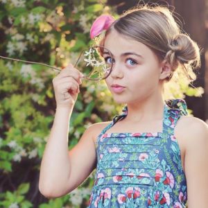
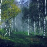
What kind of editing do you like best? Below we have an image submitted by Sonomi Johnson, edited numerous ways using Photoshop Actions. Which is your favorite? I added my comments/critique with each edit. Add yours in the comment section too.
Original:

Original: Before Editing
Edit 1: No processing except cloning. This is a great image straight out of camera, but the background was distracting. I like that Sonomi got rid of the complex, busy background. The cloning is not perfect. So if I was working with her on it, I would have her scatter the trees a bit more so they were not uniform. And there are two spots where I see a stroke just end. But once she applied actions, the cloned issues actually became less apparent. See other edits.

Original + cloned background/cloned boots
Edit 2: I like the tones added with Mini Fusion Photoshop actions. The action created a mood to the image. It seems to fit well.

Mini Fusion (Cool Blue Sea Tone) + Quickie Collection’s Sharp as a Tack
Edit 3: This edit is similar to #2, but slightly more yellow toned. Normally I prefer warm, but on this one, I actually prefer the cooler edit.

Mini Fusion (all 3 tones) + Quickie Collection’s Sharp as a Tack
Edit 4: I love the Vanilla Ice Cream Black and White Photoshop action on this image. It looks great in black and white. If being nit picky, I would say the slightly darker trees are right up the middle – so adding a few more bunches of them on the sides would help. And I might add fill light to the black skirt so we could see more detail. But overall, I love this edit.

Quickie Collection’s Vanilla Ice Cream
Edit 5: Old School Vintage is a washed out style. It works nicely for this image as well. But if I had to pick a “winner” for me it is the “edit 2.” Now it is your turn to share.

Complete Workflow’s Old School Vintage
These photos were all taken by the talented Sonomi Johnson. Her photos are amazing to begin with, great lighting, exposure and focus. But she loves subtle edits with Photoshop too.
No Comments
Leave a Comment
You must be logged in to post a comment.


Recent Posts


I like edit #2 best.
I like Edit #2 and Edit #5. Awesome picture! Love all the textures in it. Happy Shooting everyone! JMQ
background cloning is terrible!
Love edit 1 and edit 4….beautiful picture!
I like edit 3 best because there is more detail in the skirt. I agree with the cloning…it needs to be more scattered, less apparent. Plus I would have burned the photo edges a little to bring attention to the subject. Or maybe I would have left the highlights of the concrete structure around her as it was originally…darker, only processing the girl…she seems to be fighting for attention with all the business around her. But still a lovely photo.
Of what’s here I think I’d pick edit 4. What a cutie!
Love edit #2 hands down. Black & White would be my 2nd choice, but like you, would do a little more work on the back ground. 🙂 Thanks for sharing.
I like 2 and 5… i love the vintage look… my favorites are the super saturated pictures thougg, where there is a sensory overload for the eyes =)
Edit #3.The background cloning needs some fine tuning. And I noticed the railing on the left side of the image was removed, but not on the right? Personally, I’d crop the image from the top a bit; I think it would help detract the eye from the obvious repetition of the background cloning. Also, I thought the boots were a nice touch of character in the original, so I wouldn’t have cloned them out.
My personal style it that I prefer for editing to be like well applied make-up. It should bring out the natural beauty, but shouldn’t be noticeable as an edit… for portraits anyway. So, I like edit 2 as well. but, I think it just depends on your style.
I agree with everything Britneye said. For this particular photo, I like edit 2. But in general, I love the styles in edits 4 and 5.
Edit 2 looks the best on this picture – it goes with the theme. 🙂
Edit 2 looks best on this picture “ñ it goes with the theme. 🙂
#2 and the b/w are my favs!! Beautiful little girl!
I LOVE #3. #4 is my 2nd favorite!! Beautiful work!
I like Edit 2 the best as well. Cute Pic 🙂
Edit #2 is my fav!
I like 3 the best, tho only slightly more than 2. It has just a bit more pop. I have to be honest tho, I feel the cloning is far more distracting than the columns in the original image. I find my eye drawn to the repetition rather than to the beautiful little girl. Actually, I rather like the columns and would consider at least leaving in the ones in the rightmost third of the photo.
My favorite is Edit #2. I love the sharpness and the vibrancy of the colors!
I like edit #2 best. And the vintage #5 is a close second. Not such a fan of the cloned trees though. But if I hadn’t seen the original-I might never have noticed..
To be more specific about the trees…I don’t like how they become darker right behind the subject, it is distracting. Since you cloned them, I would try to increase the white space behind her head, thus drawing out the subject. Her eis an example of a shot I took that has the person “framed” by the white space in the background.
Love # 2 and I like #5 second. More of this type post would be great!!
Such a beautiful photo. Hmmmm #2 and #5 are my favorites. But I’d also like to say that I appreciate this post… Your comments on each are so helpful, including how you would further improve the photo, telling what to look for (for example, wanting to bring out more detail in the skirt with fill light). Thanks so much!
I love #2. However I’m sorry to say that clone-stamp job isn’t the greatest, the clones are soooo obvious :-/
I LOVE edit 2 the best!
I like #1 and #3 the best.
I like 2 the best!
I like #2 the best. I don’t particularly like how the trees are cloned but I wonder if it would be as noticeable to me if I had not seen the original beforehand. I would point out that the tree right behind the subject’s head makes me think she is wearing a feather in her hair at first glance. Once I noticed that, I kept being distracted by it. But I like the hardness of the stone combined with the softness of the girl and dress. To me, the cool tones of #2 work with the stone…..you can almost feel the coldness of the stone!
I like edit 2 the best 🙂
May I suggest we take Touch of Light/Dark and help bring the viewers eye to the most important thing in the frame, the girl? Right now, your eyes are drawn past her to the bright trees in the background. The crop actually enhanced that issue, instead of lessened it. There’s still a lot of head room in the photo, so I’m betting an even closer crop would work. As for the processing, Edit 2 is my favorite. I really like Edit 4, but really miss the sweet pop of pink from the flowers. If I’d never seen it in color, I’d love the black and white.
Love edit 2 as well. I love that your actions are subtle but dramatic.
I like the “Old School Vintage” edit.
The black and white one, without a doubt!
I prefer #2 and #5, but I think the trees should be edited to not be as “balanced”.
I love edit number 2’s color but would have preferred it without the cloning. I like the original building.
I have the same feeling! Those trees are ugly cloned.
Cool blue, def the best. I would have just got rid of the tree-lot in the background and slipped in a nice cloudy sky but that’s me. Cloning out the boots was perfect.
I love edit #2!
I prefer slightly warmer tones, so I’m gonna go with Edit #3. Beautiful girl!
Edit 3 and 5 for me…
As far as the subject goes, I like 3 and 4, but the background is so distracting. Instead, I would have cropped it about to the top of the pillars in the back, maybe extending them a bit to center up the image. Then I’d remove the table in the back and the hand rails on both side, but I’d leave the stone in because I think it adds to the overall image. Then I’d run a really good vinette action on it to bring out the girl and tone down the detail of the background, but not the texture of the stone in the foreground.I strongly recommend only using the cloning tool in small areas and never where the repeat can be easily spoted.
i can’t get past the cloned trees to even look at the edits. no offense, but i HATE obvious cloning; doesn’t look realistic at all!