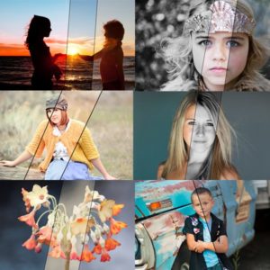
Featured Products
-
Sale!
-
Sale!
-
Sale!
-
Sale!
-
Sale!

Last week we announced 2 ways to win our upcoming Quick Clicks Collection Lightroom Presets before you can buy them.
- Quick Entry: sign up here (1 set being given away to a random winner)
- Share a Blueprint: details here (3 sets will be given away – winners will be selected by Ellie and Jenna on October 6th)
We are excited to see your before and after Blueprints using MCP’s actions. Make sure to enter. Check the MCP Blog on October 6th to see if you are one of the winners! Good luck.
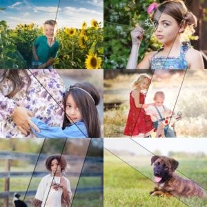
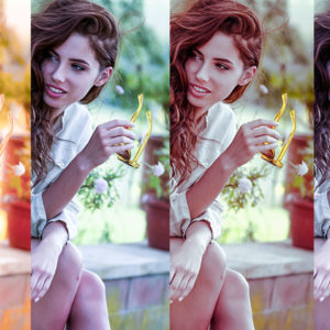
Here are a few more “sneak peeks” from the Quick Clicks Collection for Lightroom. These were ONLY edited in Lightroom (labeled in Photoshop).
Please comment below and let us know your favorite versions of each photo.
Photo below by Andee Tate of Crave Photography


Photo below was taken by my childhood friend Kelly (Harmon) Roper of Kelly Roper Photography. Our love for photography brought us back in touch with each other after many years.


No Comments
Leave a Comment
You must be logged in to post a comment.


Recent Posts


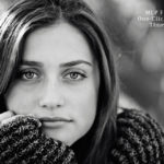


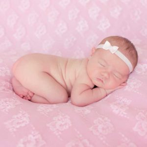
I prefer the crop on the b/w – just seems a little more “artsy” or something……and definitely the b/w vs the other two – IMO 🙂 I enjoy reading your blog full of amazing tips!
I love the crop of the b/w – I just like how her face doesn’t fill the entire frame. I think I prefer the color picture though – I don’t know why but it seems to me that sometimes there is too much lost in b/w images (I know that’s kind of the point) – but for me noses are important and it seems that the bridge of the nose often gets lost with high contrast b/w images… just my opinion though – I love the shot and can’t believe it’s with your flash!
I prefer the b/w and I like the crop better. The color is too much “in your face”. I like the wider crop. It’s still intimate but not distracting on how close it is. Beautiful work!
I like them all & wish my images could come just a tinsy bit close to these lol. But I prefer #2 the colors & closeness of the crop just draw me into it.
All are beautiful. What a {VERY} pretty little girl. When I use my flash, I don’t get great catch lights. Is there a secret? Also, I was wondering if you had a tutorial on web sizing and sharpening. Love your website. Love your actions. I can’t seem to get enough of both! Thanks for all you share!
B&W for me. The purity of her subtle expression is more captivating. Her eyes are much more the center of my focus. She`s adorable in both though. Beautiful image.
I love the B&W….I think because of how she is posing. Both look great though 🙂
I love the crop on #1. I love both the color & the b/w, but really I think I like the color better because of her beautiful eyes.
i prefer the color to the b/w beacause of the beautiful color of her skin and eyes. perfect exposure! if your exif data has been stripped, would you kindly share it? dragging the shutter is something i am trying to master and this shot does it so well. thanks in advance!
just found the metadata! thank you. btw, i prefer the crop in the b/w! it’s more relaxed. (does that make sense?!)
Jodi – i love when you show us your secrets! I LOVE the B/W version and crop. How is the complete action set coming along for PSE – Mac version. I want, i want, i want!!!!
I think the crop on the b&w looks better but her eyes seem to be lost on the b&w. For that reason and several other smaller reasons, I like the color better.
They’re both great. I like a tight crop, but the bottom image is enough of a tight crop as well. For my own annoying need to know more, I get disappointed when you say “adjusted to taste”. As we all pretty much agree here that these are adjusted to all our taste level, can you be a little more specific? Also, I always struggle with skin tones and you don’t seem to have that issue. Can you talk about that too? (Am I being too greedy?) Love the bw, I have MCP Take My Color Away and it’s good too, but I’ll have to save up for this one. Have seen bw where the skin is creamy (another favorite photog) and I would love to learn more about getting that look as well. One more thing I would do (you did enough on the button!) is remove the stray hair from her face, the one over her left eye at least. Otherwise, WOW; great looking kid and beautiful image. Thank you, as always, for sharing!
Jodi, I love the cropped one, because it focuses more on the eyes and they are beautiful and I love the color and bw but probably the bw, because of the awesome contrast. Very awesome.
I like them both – however, prefer the color b/c of the creaminess of her skin in contrast to her gorgeous brown eyes, and the crispness of the feel overall. The background colors are often distracting to the subject, but aren’t in this case. The crop is great in both — hard to pick just one. I forget if you have actions for PSE and am still debating on updating to PSE 7.0 (from 6.o) or a much more $$$ upgrade to a full photoshop….any thoughts? THanks for your tips – and I’d also love more detail on your adjustments (although I’m sure it’s harder to describe how you tweak each photo). Colleen
I think the color one is perfect. She has the most gorgeous brown eyes that get lost in the b&w. Beautiful little girl…
B&W and love the tight crop it makes all the difference.
It’s amazing– beacuse the SOOC shot looks great just the way it is. You don’t realize from looking at the SOOC shot, how much more wonderful it can be until you feast your eyes on what you’ve edited. The post production shots are fabulous! I really like the way the black and white photo makes her eyes pop and truly become the focus of the image! 🙂 The crop on both the black and white and color image are good.I thoroughly enjoy your blog! Thank you for keeping it so intersting and fun to be a part of!
Awsome! I liked the 2nd and BW images. I struggle capturing the sparkle in the eyes without the catch that the flash creates. Do you have a tutorial on this?
I love both of the images she has the most amazing eyes, the color of her eyes is of course more apparent in the color, but I think I prefer the B&W I am partial to black and white. Keep those images coming. Pam
I have to say the B&W. I think the crop is perfect and of course the coloring is perfect. Did you get the lightness on the face in the touch of light/touch of dark action you have. I am totally amazed by your talent. Love your website and blog. Debating on what to order first. Will definitely have to order the magic templates first soon….. Lots of people use them and they are AMAZING!!
The B&W one is AMAZING! I love the color one, too, but I LOOOVE the B&W one! I like the crop on that one better, too! It’s close up, but not too close. What a beautiful image – this child’s mom has got to be THRILLED! 🙂
Both are stunning, but I prefer the b&w because to me the eyes are the true focus of attention – no distractions by colors around them.Gorgeous portrait work, Jodi!
I have a question….can you give a little more explanation on how you do the eyes? Even using the “Eye Doctor” action, I can’t make mine come out like that. As a general guideline, what size/opacity brush do you use because I’m thinking that might be my problem.
well size depends on resolution of the file. But I use one that just covers the catchlight on the catchlight. One that covers the whole eye for the sharpening. Small one if using the pupil/lash layer. And one the size of 1/2 the iris on the iris. make sense?Also – the main thing with eyes is what you start with. you need catchlights – even faint are ok – to make them pop. You need the eyes sharp to make them tack sharp, etc…
I prefer the crop on the b/w, but the edited color image. I LOVE LOVE LOVE b/w but sometimes feel like the eyes lose some depth when they are that prominent in the shot. Love your work – thanks for sharing it with us 🙂
Wow!!! The edits are both GORGEOUS, but I really prefer the black and white on this one! It is STUNNING!!!! I’m so glad to see you added a SOOC shot. I’ve been wondering what your shots look like before editing. Thanks so much for sharing!!