Featured Products
-
Sale!
-
Sale!
-
Sale!
-
Sale!
-
Sale!
-
Sale!
-
Sale!
-
Sale!

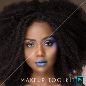
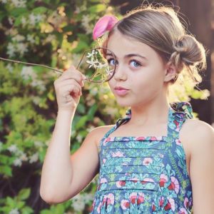
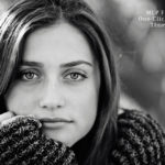
Want to color pop your images in Photoshop? This week’s Blueprint shows one way to achieve rich, super powerful color. I get asked about this look all the time in reference to a few photographers who pull out these deep hidden colors. This look and style is trendy and fun, and many will love it, but some will not. Recently it seems either photos are heavily color popped or the opposite, using vintage photoshop actions.
For this Blueprint, I wanted to show you how to get rich, vibrant colors using color pop Photoshop actions.
Here are the details of this edit – all the actions used, except the frame, were from the Bag of Tricks Photoshop action set.
- Since I wanted to show a rich, deep color pop, I started with the Magical Color Finder Brush {Intense} action. I applied this with a 100% opacity brush everywhere except on the skin and jeans, as I did not want the skin to get red or the jeans to glow too much. I decided to get crazy and adjusted the opacity of this layer to 83%.
- The photo seemed dark in spots, and I wanted to fill in some light. I ran Magic Fill Light action at 34%.
- To make the photo more crisp, I ran Magic Clarity and adjusted the opacity to 54%.
- I wanted a bit more light on her face, so I used the Magic Light action and painted with a 30% opacity brush on her face, layer opacity left on default setting.
- Then I finished up with the Magic Dark action and with a 30% opacity brush, I pained around the edges of the photo, layer opacity left on default setting.
- For display purposes, I used the Frame It Small action from the Finish It set on both the before and after, which resizes and sharpens for web and adds a frame for the finishing touch.


No Comments
Leave a Comment
You must be logged in to post a comment.


Recent Posts


That worked out nice, seems some actions really benefit from a darker image as there starting point.
Nice job Jodi – FWIW I always crop first 🙂
the tones are really cool and dramatic – beautiful edit!
I like to crop first too most of the time – it helps dictate pping 🙂
Stunning Edit! Love the crop, really defined the emotion.
Wow. These are stunning.
I love your edit on this one. The crop, the actions you selected – really frame the subject well. It actually looks like something from the Anthropologie catalog!Thanks for sharing this simple, yet dramatic blueprint.
When you crop early, like you did in this instance, what size or aspect ratio to do you usually use?