Featured Products
-
Sale!
-
Sale!
-
Sale!
-
Sale!
-
Sale!

I love seeing how the exact same image can look completely different depending on the vision of the photographer or photo editor. We have a special feature on the MCP Facebook Group called #mcpmyphoto. By tagging your photo this way, you give permission for other photographers to edit the photo using MCP Photoshop actions, Lightroom presets, and textures. You can join us and add your image after reading the group rules.
It is fun to see the different editing styles, and it’s also a helpful training tool for photographers to learn how to get different looks in Photoshop and Lightroom.

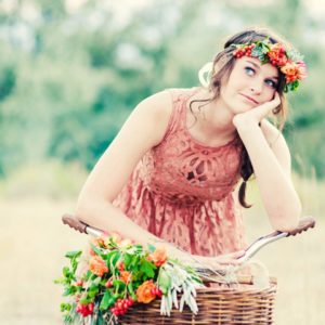
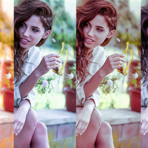
In this beautiful image by Linda Fisher Ypulong, four photographers demonstrated how they fixed the exposure and then took the image to a whole new level. Each used different actions and presets and had lovely results.
Linda’s camera settings: Nikon D610 – 50mm 1/320s f2.8 ISO 100
Here’s the original image – straight out of the camera.

MCP My Photo Version 1: Edited by Nikki Baldwin
Steps: “I started with adjustments in ACR, a brush and then overall adjustments. Then I brought it into PS and manually did some dodging and burning to draw more attention to her face, hair, clothes.
Then I ran Photoshop actions from the Inspire set. I will show my steps and layers/product-category/photoshop-actions/ used in some screen shots.”

And the results:

MCP My Photo Version 2: Edited by Amy Bellair Anderson
Steps:
- MCP Illuminate Golden Sunstream Lightroom preset
- MCP Infusion Lightroom presets: Define 2, Heartwarming 2,
- MCP Fusion actions: one click color, urban revival, and surrounded
- Manually adjusted the noise and blue luminance

MCP My Photo Version 3: Edited by Erin Niehenke
Steps:
- Adjusted exposure in ACR first.
- In Photoshop, adjusted Levels for the sky, background, and subject.
- Then used the following actions from MCP Inspire: Bittersweet and Mult-Matte (dark, intense, and warm).
- Then used a brown-to-transparent gradient layer set to soft light, and masked mostly off the sky.
- Cropped to finish.

MCP My Photo Version 4: Edited by Lauralynn Hook
Steps:
- Manual adjustments to brighten the shadows, exposure, and enhance the blacks on the raw file.
- Then brought into Photoshop CS6 and added a gradient to the sky and did some dodging and burning to and around her.
- Then used MCP Autumn Equinox (fall foliage, burnt firewood, pumpkin patch, Autumn Skies, and Dark Cherry Vignette)
- Lastly used the MCP Newborn Necessities actions (In the Spotlight, Under the Blanket, Crying for Contrast, Pick Me Up, Cake Smash, and Print Sharpie)

See more edits, including Linda’s (the photographer of this beautiful image) or share your version of this — visit this link once you join our Facebook group so you can download the raw file and play.
No Comments
Leave a Comment
You must be logged in to post a comment.


Recent Posts


I prefer #2. Colors are true to life and I like the bit of added contrast and sharpness.
I love this! Would love to see more comparisons like this!
I like 1 and 3 — 2 and 4 are a bit too harsh to my eyes. When I first looked I thought 1 must be the original. 1& 3 seem to be of the “vintage photo” school, but I like that.
Close call for me between 1 & 2 but I”ll go with #2. They are all beautiful edits.
I think I like #3. Hard decision to make though they are all beautiful edits.
i like 1 and 2
#1
#1 It looks the most like a magazine editorial and I like the contrast on the face with the soft dreamy edit on the background.
I love #3.
I’m going to vote for #2 due to the clarity…. it’s a little too sharp for my tastes. I like the coloration of #1 the best, but personally like a bit more blacks/contrast/clarity
Number 3 is my fave, but I really do love them all!
I love #2! The true to life rawness of her surrounds stands out to me and does not take away from the subject at all, in any way. Gorgeous subject!
#3 is my favorite, but they’re all amazing! I love this!
My choice is 2, but 3 is a very close second!
I prefer #3. 🙂
I have to go with #3. I’m not a fan of “haze” in a photograph which knocked #1 out. #2 was vivid, but a bit surreal for my tastes. #3 has a nice level of clarity, a beautiful sky color and some lovely warmth overall. #4 just seemed a little too rosy for my tastes. Great photo!
#3
#1 is a clear winner in my book, although a touch too warm for my tastes. I love the dreamy softness to it yet the girl pops out and is the hero of the frame – it has lifted what is an average capture. #2 is very contrasty and harsh on the girl’s skin, and it makes the background become a distraction. #3 is OK but seems to lack any punch and is a bit washed out.
1, then 3. 2 makes the scenery equal to the model. In 4 she looks pasted into the background. But clearly, each has struck a positive chord with someone.
#3 (#1 was a close second)
Number 3, but also really liked #1
#3
Number 1. Number 4, I don’t like the “halo” effect around her head. Like the edit has tried to lighten her face and ended up lightening the area around her face as well.
My favorite is #1, and #3 is a close second. I love the sky in #3, but I realize that isn’t the focus of the image. Just looking at the model and background, #1 has a softness in the background with good color, yet the model stands out nicely.
I like #3 best.
number 1
#2 – I love the sharpness of the landscape. Its harshness emphasizes the softness and beauty of the model, while in of of itself it draws the eye to explore the surrounds – but the viewer ultimately returns to the girl. The contrast of textures between the model and the background force the viewer to study the entire photograph.
#3
#3
Thank you Nikki for the editing screenshots of #1. That is absolutely the best way to convey editing information to someone learning actions. And won’t we all use (and buy!) more actions if we know how to use them properly.I love the softness of #3.