Featured Products
-
Sale!
-
Sale!
-
Sale!
-
Sale!
-
Sale!
-
Sale!
-
Sale!
-
Sale!

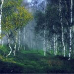
Playing in Photoshop is fun and often therapeutic for some photographers. True photography artists, like Pia Rautio, use our Lightroom presets and Photoshop actions as tools that help mold their beautiful straight out of camera images into a unique look they can call their own. I know a “Pia” photo when I see it, and even though she uses our products, her images remain true to her style.
So, don’t let some of the big name photographers who host editing workshops convince you that actions and presets are evil and that you need to spend a grand to edit their way. Actions and presets often help photographers find their signature looks – and these powerful tools to save you time edit after edit.
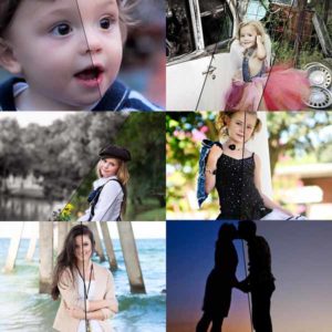
In the images below, we showcase five different edits.
Pia’s camera settings were:
ISO400 1/400 f2.8 @200mm – in all natural light using a Canon 5D MK III & 70-200 2.8L II
Here’s the straight out of camera – already pretty amazing!

And her edit using Spring Splendor Photoshop actions:
- Base 15%
- Vintage Postcards 25% (Hazy layer off)
- Sunlight 60% (from top)
- Cherry Blossoms 20% (only layers Light Hazy Wash + Cherry Blossoms)
- Antique 30% (Fresh Squeezed OJ + Hazy Days off)
- Orchid (Only layers Orchid Field + Orchids + Add contrast)

And her edit using Summer Solstice Photoshop actions:
- Base 25%
- Warm Summer Vignette 24%
- Ocean Breeze 48% (layers Blue Water + Ocean Breeze off)
- Oasis 45% Â (only layers Spice Vignette + Deep and Rich)

And her edit using Autumn Equinox Photoshop actions:
- Base 15%
- Warm Cider 10%
- Japanese Maple 20% (only layers Fall Reds + Dark Edges)
- Back-to-School 30%
- Fantasy Football 25% (Cool Defense & 50 Yard-Line layers off)

And her edit using Winter Whirlwind Photoshop actions:
- B&W 100% – masked off flowers ~65-80%
- Details 25%
- Base 25% (no toning selected)
- Winter Blues 10% (only layer Blues)
- Storm 20% (only layer Storm)
- Barren 40% (layers Dark & Icy)
- Season’s Extras: Temperature Adjuster (added red and magenta on flowers to make them match the light tones of the rest of the image)

And lastly the Inspire actions + MCP Texture Play Overlays:
- Base 30% only on kids
- MCP Texture 07 from Texture Play Overlays added with MCP (free) Texture Applicator
- Custom Edge Burn 15%
- Custom Ball of Sunshine 25%
- Sweet Dreams 20% (only layer Sweet Dreams)
- Modern Matte Twist 35% (masked off faces to bring back contrast)
- Georgia Peach (only layers Peachy Color Changer and Peachy Contrast)
- Bittersweet 25% (only layers Rich Chocolade + Dark Chocolate Contrast)
- Mood Ring Wistful 20% (toning)
- Manual Color Switcher on the bowtie (from blue to purple)
- Rich 40% On faces

Pia’s daughter Taika (3,5+ yrs old) said that her favorite is Autumn (because she likes “the greens like that”), next best Summer (she “likes all colors”), then Inspire (no comments), then Spring (I like it because it has all the light) and Winter she likes the least (but she reckoned her brother would probably like colorless version the best.
After seeing all these edits, we’d love to know which you like best? Answer in the comments below.
No Comments
Leave a Comment
You must be logged in to post a comment.


Recent Posts


I like the un-edited version!
Love them all but selective color. I don’t think it enhances the image at all or helps to tell the story. But I think the very last one is my personal favorite. Beautiful children!
I like the unedited. I wouldn’t change a thing.
I like the last one (Inspire actions + MCP texture play overlays) the best.
I like the un-edited one.
The un-edited version is pretty amazing but if I had to pick an edited version it would be the Summer Solstice photoshop actions.
The Summer Solstice Photoshop actions (number two) is my favorite. I love the way that the children are pulled from the background in the image, with the different depth-of-field layers. I feel like the children’s skin tones are the most natural looking here, and high contrast is a personal choice that I find draws me in.
I love the Summer one 🙂
I also like the unedited but I also like the third edit.
I’d have to say my fave is the summer one. Love the deep greens and rich look.
Unedited one is best.
I like the Inspire Actions version (last one) the best, Summer Solstice second. I would still tone down the green/yellow of the grass & trees a little more. I prefer my greens to be less intense, desaturated and cooler. Personally, I am not a fan of selective color, so that’s my least favorite.Cute shot, though! Love the framing of the trees!
I like spring and unedited. The children pose and composition
I love the unedited one but I also like the Summer and Winter ones.
The unedited one is the best, last one also good.
I like Summer Solstice most; the vignetting is great. All edits are good because they have been handled with subtlety.
Great shot. I like the last one best.
The last one!
I love the unedited. And if choosing an edited, the summer look.